Introduction
I am doing this case study as a capstone project after completion of the Google Intro Data Analytics Certificate Course. This covers all steps of the data analysis process. These steps are ask, prepare, process, analyze, share, and act. Growing up in Chicago, I took the train to high school throughout the year and I often wished that the station platforms were enclosed because it was really cold to wait outside. They did have a few heaters on during the winter but if there were too many people those spots were already taken. If there indeed is a significant decline in the number of people using the trains during the winter, this information could be used to help make the case for enclosing stations. I also looked into two other patterns that I have always been curious about but didn’t really have to tools to evaluate until now. This case study takes open data provided by the Chicago Transit Authority (CTA) of Chicago showing how many people entered each station each day from 2001 January 1st to 2020 December 31st.
For a full review of the original data and the code I wrote to clean, analyze, and visualize this data in R, please go to the following link.
Hypothesis
I have three working hypotheses.
- More people use the ‘L’ during the summer than during the winter.
- More people commute to downtown for work on weekdays than take the ‘L’ for leisure.
- Individual stations, bus stops, or bus lines are likely to have a similar number of riders year over year with little relative movement. In other words the station that sees the most passengers is likely to be the same from year to year. Except maybe the pandemic might change the relative positions…
Data
In order to more easily evaluate if these patterns are true, I began by looking at ridership numbers for individual stations.
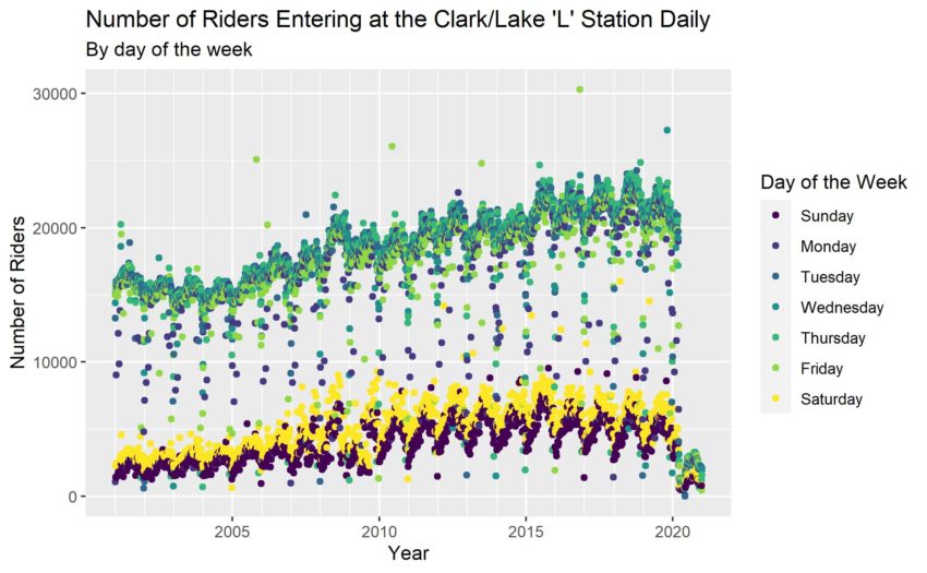
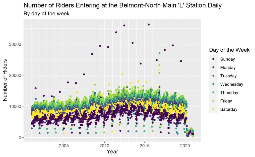
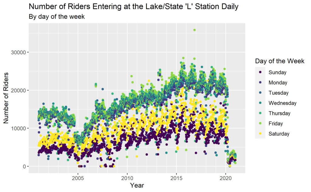
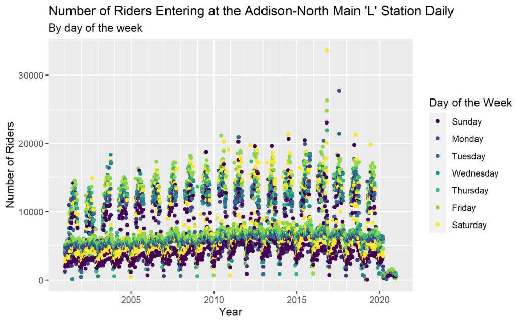
Stations with the highest number of riders on a single day.
#1 Belmont & Sheffield Station (Red, Brown, and Purple Lines)
#2 Lake & State Station (Every Line except the Blue Line)
#3 Addison & Sheffield Station (Red & Purple Lines)
Stations with the highest number of riders over the study period
#1 Lake & State Station (See above for chart)
#2 Clark & Lake (Every Line except the Red Line)

#3 Chicago & State (Red Line)
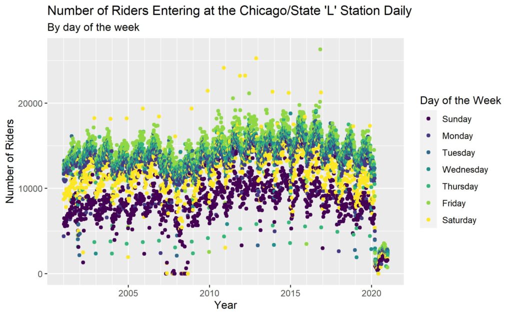
#4 Belmont & Sheffield (See Above for Chart)
#5 95th & Dan Ryan (Red Line Southern Terminus)
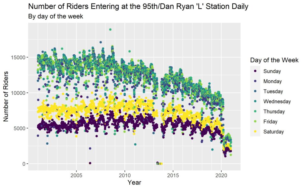
Stations with the lowest total ridership numbers over the study period
Note: This is not average annual ridership, but total ridership over the entire study period. As such, two of the three stations are on here due to being newly opened during the study period.
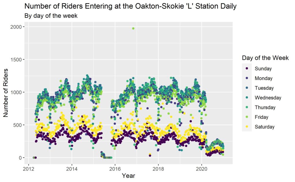
#1 Lowest total ridership goes to the Oakton-Skokie Station on the Yellow Line
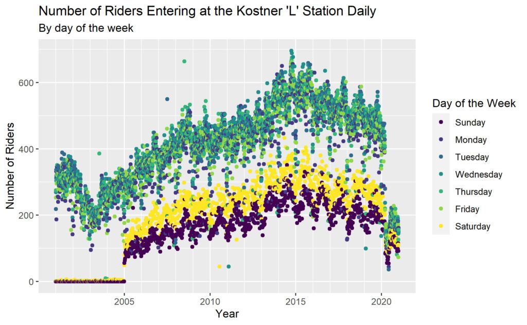
#2 Second lowest total ridership goes to the Kostner Station on the Pink Line
#3 Third lowest total ridership goes to the McCormick Place Station on the Green Line
Analysis
Now that I have seen characteristics of a few of the various ‘L’ stations graphed out, I think there are some statistical analyses that can be applied that might give us some interesting insights into the system and every station.
Weekly Variations
One of the key differences I noticed between the different graphs was the difference between the weekday ridership numbers and weekend ridership numbers. Perhaps predictably, the number of weekday riders is usually higher than weekend riders. However, some stations have a much higher daily ridership numbers during the week about 400%+ higher than they do over the weekends. Other stations have a smoother gradation between weekdays and weekends with weekdays being busier but only by about 50% to 100%. In general, the spread of the weekday numbers typically appears to be much more narrow than that of the weekend numbers.
Stadiums & Seasonality
However, the Addison station had an interesting mix with the differences between summer and winter ridership being much larger than weekly variations. This is most likely due to the influence of Wrigley field games on that station’s ridership patterns. Furthermore, while all of the stations typically see higher ridership in the summer, at the Addison station, this relationship is particularly pronounced.
Events & Daily Ridership Outliers
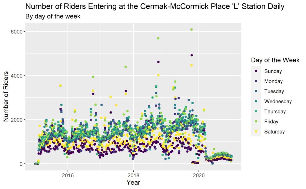
Specific local events near train stations can have an out-size impact on daily ridership numbers on specific days. For example, the Belmont station has an annual peak of daily traffic on one Sunday every year ranging from 2 to 4 times its normal daily ridership numbers. These numbers are explained by the annual gay-pride parade that is held only 2 blocks away from the station. Similar patterns can be seen at the Cermak-McCormick Place L Station which has a single weekend every year that has about double to triple the normal daily traffic on Friday, Saturday, and Sunday which is the International Manufacturing Technology Show.
Low Ridership Commuter Stations
The Oakton-Skokie station has some interesting patterns that are a little more difficult to see on busier stations. In particular there is a much more obvious seasonal shift difference between weekday and weekend ridership. In the Oakton-Skokie Station, weekend daily ridership generally peaks in mid to late summer while weekday ridership peaks in late fall and then drops drastically during the winter. This might indicate an opportunity for a spring drive at this location to increase daily commuter ridership during the late spring and early summer months.
The Pandemic
Last but not least, the pandemic. Wow, what a drop in ridership. What is interesting is that weekday ridership numbers remained higher than weekend ridership numbers. Furthermore, while the range tightened significantly, it appears that the ratio of weekday to weekend traffic may have held fairly steady despite the rapid and unprecedented changes in ridership volume.
Weekend vs Weekday Ridership
After completing this, I then decided to look at the overall ratios of weekday to weekend commuters to see what these numbers might reveal about the different stations and the city. The following map was produced by plotting dots at each stations that are sized by the total number of riders over the study period and colored based on the ratio of weekday to weekend ridership.
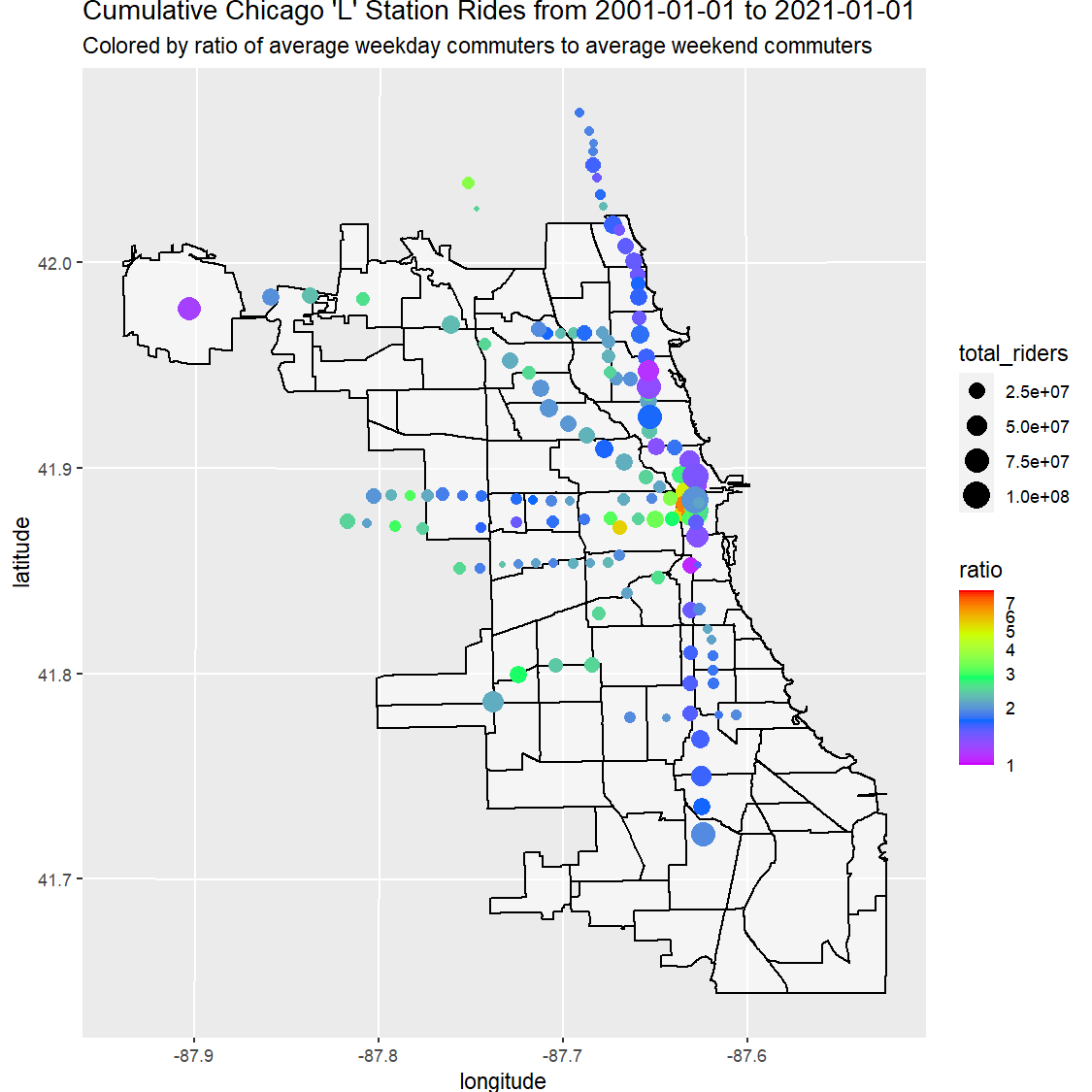
Stations that are purple indicate a ratio close to 1 weekday commuter to 1 weekend commuter meaning that they have a fairly evenly distributed weekly passenger flow. At the upper end of the range in Red, Yellow, and Green the main ridership demographic is the weekday commuter. In the range that is colored Green this means that for every weekend commuter there were about three weekday commuters. The vast majority of the stations appear to fall in a range between 1.5 and 2.5 weekday commuters to weekend commuters. The distinctly purple spots on the map are all located close to large local cultural amenities such as stadiums, shopping areas like the Magnificent Mile, or transportation hubs such as O’Hare airport.

Downtown shows both extremes. The redline stations north of downtown close to the shopping district of the Magnificent Mile skew towards purple while the stations downtown by all the office buildings predictably skew green to red. The purple dot at the bottom of downtown is the station closest to the Soldier Field Stadium. The few bluer dots in downtown are located around the theater and arts district in downtown where the mix of weekday commuters and weekend cultural amenities appears to have pushed the average down a little but not enough to get into the purple range.
Conclusions
Hypothesis 1 that more people use the ‘L’ during the summer than during the winter does seem to be mostly true. All of the stations see some seasonal fluctuations peaking from mid summer to late fall although the degree varies from station to station. More analysis will have to be done, but it appears that employment commutes are less effected by the seasons than leisure rides. This supports the idea that people are choosing other modes of transportation due to weather causes discomfort, although to be certain one would need to look at the total trips taken over the seasons to see if it is not just a general reduction in travel versus a shift in mode of transport.
Hypothesis 2 that more people commute to downtown for work than take the ‘L’ for leisure seems to be supported by the data although there are some notable exceptions. In particular stations by major cultural, shopping, or sporting areas seem to have a more equal ratio of weekday to weekend trips although the average daily weekday trips are still higher than the average daily weekend trips at all of the stations. The map of the city of Chicago shows an interesting pattern. Most of the stations that are located on feeder train lines into downtown have a ratio of around 2:1 of average weekday daily rides vs average weekend daily rides. Where it gets really interesting is downtown, where the ratio either drops closer to 1.5:1 or spikes up to 3:1 or more and only 4 stations are hovering around the 2:1 range. The other interesting finding was the stations by the airports and sports stadiums have a ratio much closer to 1:1.
Hypothesis 3 is that individual stations, bus stops, or bus lines are likely to have a similar number of riders year over year. I didn’t actually get around to analyzing this at a systemic level but just based on the data that I have looked over, this does seem true, with the exception of the pandemic, where I would have to do more detailed statistical analysis in order to see if the data actually supports this hypothesis.
Next Steps
Since this is my first case study I did in R, I still have to learn how to use many of the statistical analysis and mapping tools that R has in order to evaluate the data and answer many more interesting questions. One question for additional study would be how much the alteration of schedules might impact ridership numbers. It would also be very interesting to see how housing density and commercial density impact ‘L’ ridership numbers. I hope to come back to this case study at some point to show changes over time and see if population density near a train station is a leading or lagging indicator for public transit usage. Furthermore, I would want to see data on other modes of transportation including but not limited to micro-mobility, pedestrian trips, and cars. I also want to add more graphical cues to the map of Chicago, primarily the ‘L’ routes, so that it is clear which stations are on which routes. In addition, I want to look an annual averages when doing comparisons instead of total ridership numbers. Last but not least, I want to look at the few fully enclosed stations that Chicago has (Red and Blue line stations in downtown) and see if their seasonal patterns are different than other stations. This would lend more support to Hypothesis 1. Last but not least, the map showing weekday to weekend ridership ratios might help identify areas where people are not comfortable going during the weekend. In order to better utilize the existing infrastructure, the areas near stations that are red might be targeted for weekend events to increase ridership at those stations. Optimal use of the system would theoretically yield a city with ratios much closer to 1:1.
Datasets & Resources
Data sources and research resources used for this case study are listed at the following link. If it doesn’t direct you there automatically, click on the Resources heading to skip directly to the data set links.
